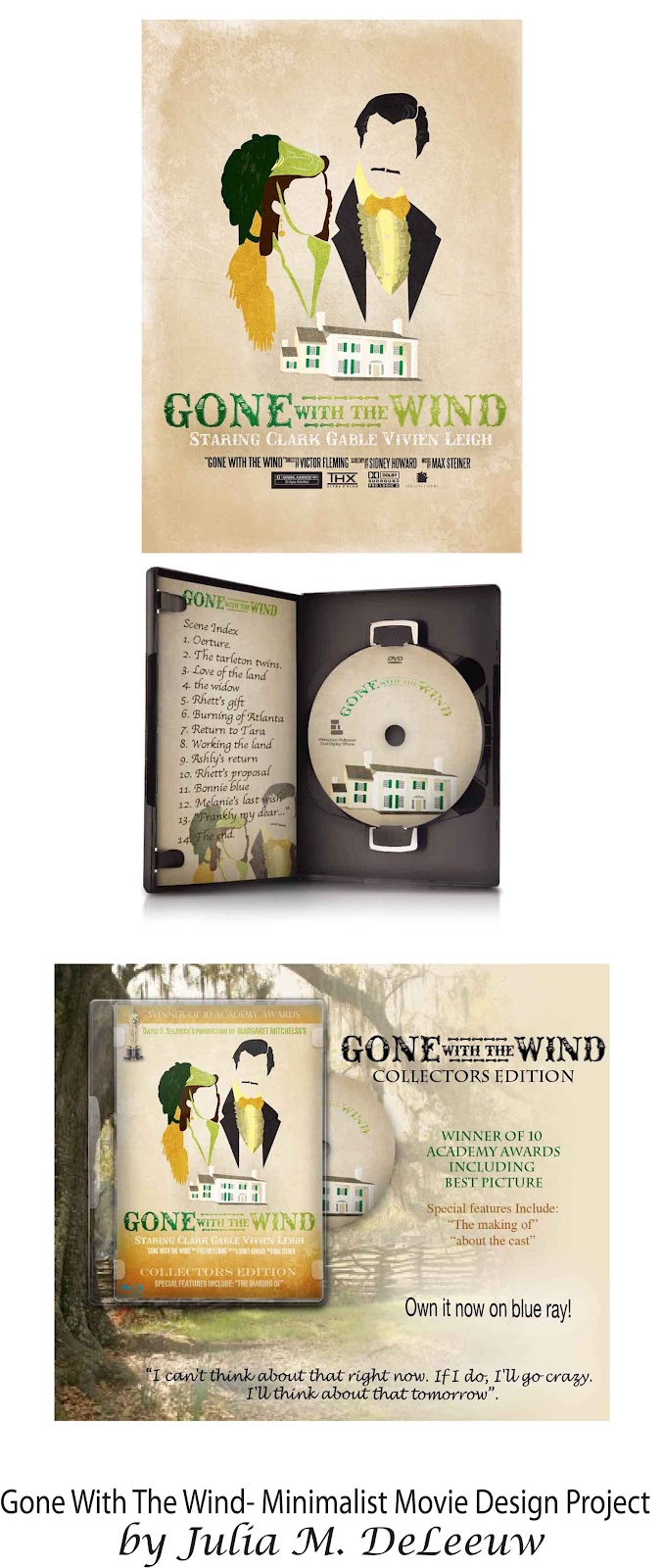
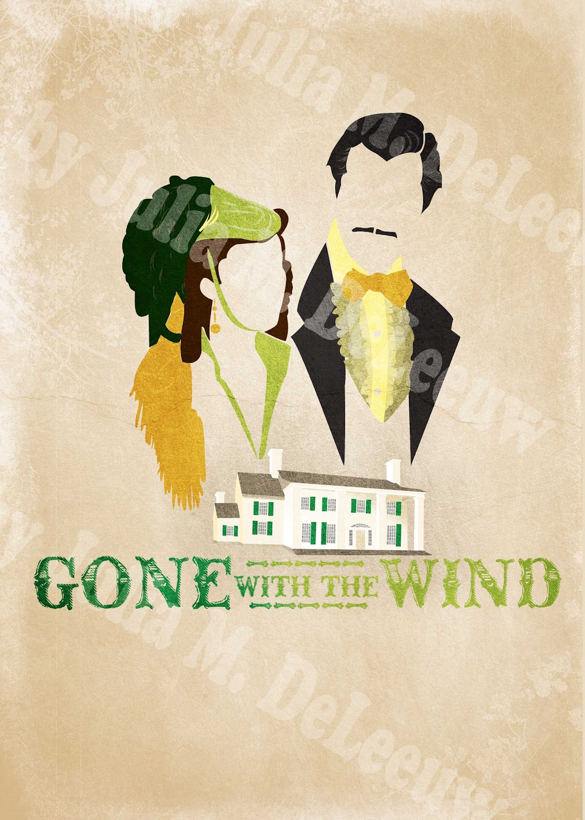
I am in love with all the fun minimalist posters out there right now and was so inspired I thought I would challenge myself to make a minimalist Gone With The Wind movie poster for my college photoshop class assignment. It turned out so much better than I thought. I think this is definitely going up on my wall! I actually think the blue ray ad turned out the best. It was an unexpected surprise. I’ve also been toying around with the idea of opening an etsy shop and selling prints. But I will probably have to wait until after I graduate in a year when I have more time on my hands.
What do you think? Would you buy this print? (without the watermark of course)


